
CSS Layout Breaking on Mobile? Fix Responsive Design Issues
Skill Level: Beginner | Affects: All websites, all frameworks
Is your website breaking on mobile devices? Elements overlapping, horizontal scrollbars appearing, or text running off screen on phones but looking perfect on desktop? This is the classic “responsive breakpoint” failure. Your CSS media queries aren’t catching mobile viewport sizes correctly. Here’s how to fix the layout collapse in minutes.
Understanding the Mobile Layout Collapse
When your site looks fine on desktop but breaks on phones, it’s usually due to:
- Missing viewport meta tag (causes desktop scaling instead of responsive)
- Fixed widths (px instead of % or vw) that exceed mobile screen width
- Flexbox/Grid without mobile breakpoints (4 columns become squished instead of stacking)
- Images without max-width: 100% (forcing horizontal overflow)
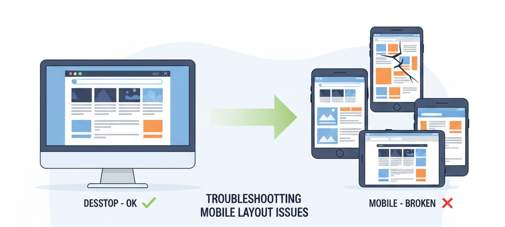
The Critical Issue: Mobile browsers assume your site is “desktop width” unless told otherwise, creating that tiny-text zoomed-out look or broken overflow scrolling.
Fix 1: Viewport + Mobile-First CSS (Recommended)
The immediate solution is adding the viewport meta tag and implementing mobile-first media queries.
Step-by-Step:
- Add to your HTML <head>:
<meta name="viewport" content="width=device-width, initial-scale=1.0">
- Reset your container CSS:
.container { width: 100%; max-width: 1200px; margin: 0 auto; padding: 0 15px; box-sizing: border-box; } - Make images responsive:
img { max-width: 100%; height: auto; display: block; } - Fix grid/flex layouts for mobile:
/* Mobile first: stack everything */ .grid { display: flex; flex-direction: column; gap: 20px; } /* Desktop: side by side */ @media (min-width: 768px) { .grid { flex-direction: row; } } - Test on actual device: Open Chrome DevTools (F12) > Toggle Device Toolbar > Select iPhone 12 Pro or similar
Result: Layout adapts instantly. Content stacks vertically on mobile, expands to columns on desktop. No more horizontal scrolling.
min-width media queries (mobile-first) instead of max-width (desktop-first). It’s easier to scale up than squash down, and matches how CSS is processed.Fix 2: Professional Responsive Audit (Slower)
If you have complex legacy code or custom frameworks.
Process:
- Hire frontend developer for responsive audit ($200-500)
- They’ll rewrite your CSS architecture using modern Grid/Flexbox
- Timeline: 1-3 days depending on site complexity
When to use: Enterprise sites with 50+ pages or custom CMS themes that can’t be easily patched.
max-width: 100% on images. Try Fix 1 before paying for a full audit.Prevention
- Design mobile-first: Sketch mobile layout before desktop
- Use relative units: rem, em, % instead of px for spacing
- Test on real devices: iOS Safari renders differently than Chrome emulator
Bottom Line
Mobile layout breaks are usually one missing meta tag away from working. While professional audits help complex sites, adding the viewport tag and max-width images (Fix 1) solves most responsive issues immediately. Test on actual phones—emulators lie.